Sample Imagery


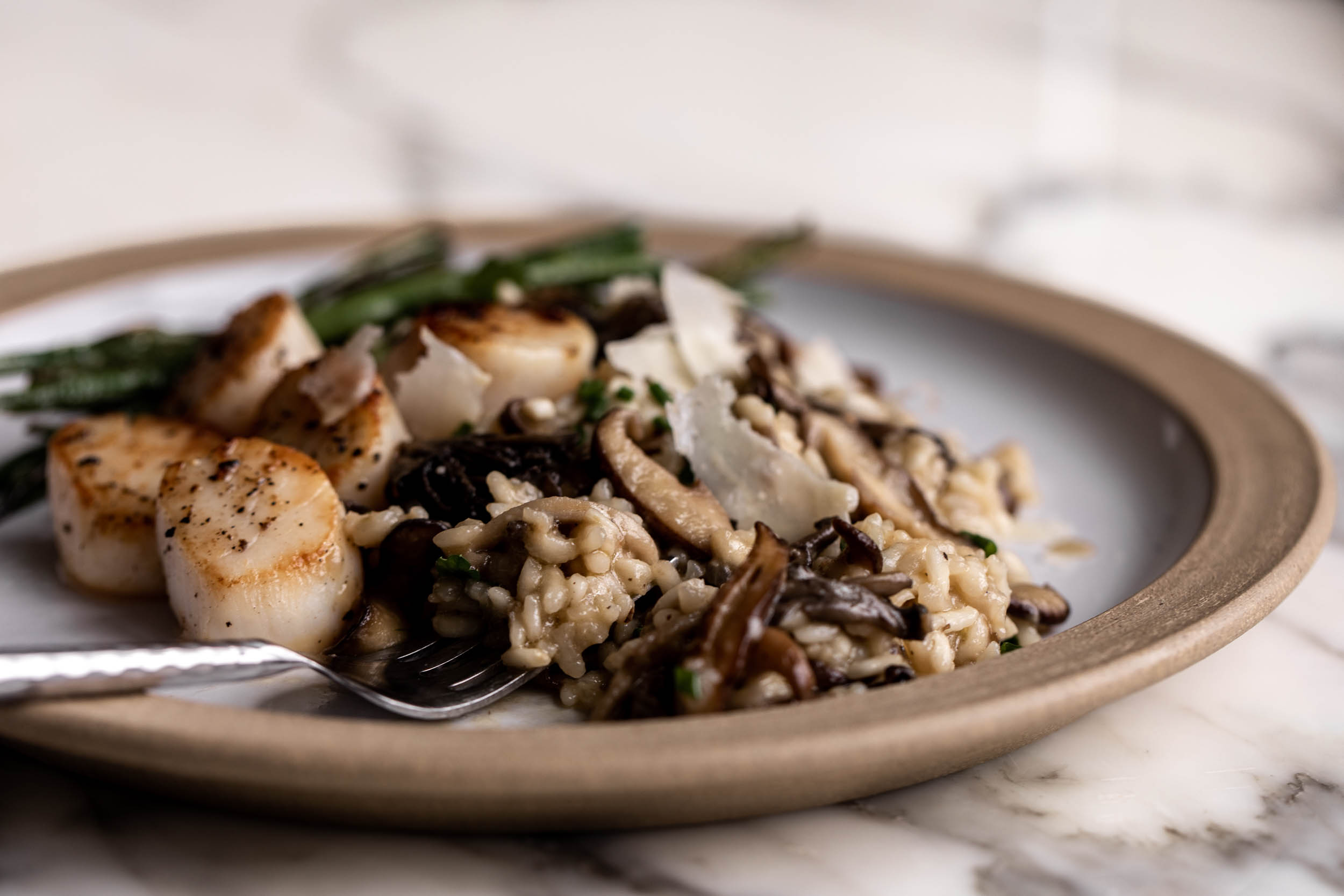
Description: I've always wanted to make my own mushroom risotto ever since studying abroad in Florence. I love the dish for its earthy and savory flavors combined with a creamy sauce.The slow cooking time of the broth and the number of aromatic make the recipe somewhat hard to follow. I hope structuring a website can help with the process.
Yield: 6 servings
6 to 7cups chicken, vegetable or garlic broth or stock, as needed
Salt and black pepper
2tablespoons extra-virgin olive oil
½cup finely chopped onion, or 2 shallots, minced
¾ to 1pound wild mushrooms, cleaned if necessary and torn or sliced into smaller pieces if thick (small wild mushrooms should be left whole, mushrooms like maitake can just be separated into small pieces)
2garlic cloves, minced
2teaspoons fresh thyme leaves or chopped sage
½cup dry white wine, such as pinot grigio or sauvignon blanc
1cup frozen peas, thawed (optional)
2tablespoons chopped fresh parsley
½cup gwerated Parmesan cheese, or a mixture of Parmesan and Pecorino Romano
This recipe by Martha Rose Shulman is published on New York Times cooking.Here's a link to the original page.


This site makes effective use of images to appeal to viewers' appetite. The system of typography, however, can be much improved by using a less decorative display serif and paired with a sans-serif body text. The search options can be referenced: "type of meal, by method, diet specific, holiday + seasonal, drinks, cuisine" if I were to build a more complete recipe site.
This site has more communicative individual recipe pages - including a checklist for ingredients (a clickable list where items can be checked off), and a recipe card that gives a brief of the prep time, cooking time, serving size, cuisine, etc. of the dish. There are also links to similar dishes. One flaw is that images are too big and prevents smooth scrolling /reading.
This site appeals to a community of viewers who interact by commenting and rating the recipes. For such a large platform, there are many referenceable featuers such as clean introductory cards for each recipe (including the cooktime and a one-sentence commentary) that can be easily scanned thanks to effective typographic hierarchy. The layout for ingredient and instruction secitons side by side is also easier for viewing and prevents back-and-forth scrolling.It also has a well-designed category function where you can browse by ingredients.
Regrocery Regrocery uses bold and appealing colors on a clean, minimalist interface design, a combination that plays up the appeal of their products and optimistic lifestyle. The appetizing design is further helped by easy navigation and the use of typography. The combination of a playful bold vertical display letterform successfully distinguishes itself from the smooth flow of horizontal body copy to create hierarchy.
International Health Report 2020The International Health Report 2020 has a fun layout with text bubbles and stylized pop-up windows. It is engaging with its combination of data visualization, interactive storytelling, and modern typography. The information is accessible, although the text competes a bit too much with each other.
Reading Machine Reading Machine is an experimental web design project that combines sound with bits of text to create a poetic digital reading experience. The site's structure is simple and navigable, with a main menu that links to individual pages for each piece of writing. I thought a similar parallel structure could be created for recipe websites.